

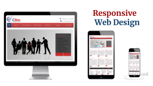
Responsive design is a Web design and development technique that creates a site or system that interacts with the size of the user’s screen. The quick design responds by improving the user browsing experience by creating a responsive and flexible web page that is optimized on the device that accesses it.
Rapid web design response is an approach that proposes that design and development respond to user behavior and environment based on screen size, platform and routing.
This exercise includes a mixture of flexible grid and an intelligent use of layouts, images and CSS media queries. Since the user switches from the laptop to the iPad, the website should automatically switch to adjust the resolution, image size and scripting capabilities. You may also have to look at the settings on their devices; if they have an iOS VPN on the iPad, for example, the website should not prevent the user from accessing the page. In other words, the website must have the technology necessary to automatically respond to user preferences. This would eliminate the need for a different design and development stage for each new instrument in the market.
There is a wide variety of information on sensitive web design available on the Internet, and much of that information is abstract, philosophical and anecdotal. If you are looking for a clear and concrete understanding of the basis of sensitive web design, there are three techniques that work together in Responsive Web Design:
- Fluid Image
- Fluid Grid
- Media Quarry
Read Related Article –
Fluid Image and Fluid Grid:-
What is the best way to design a website that is displayed on hundreds of different screen sizes, some of which may not yet exist? The best way is not one made up of catering for specific devices; it makes your design more flexible, flexible and adaptable to screens of all sizes, even sizes that are not yet popular.
Media Queries:-
Media queries are probably the most important tool a web designer has to make their sites receptive. This set of rules allows developers to create fluid designs that adapt without distortion or loss of quality to the viewer’s device. It is good to note that this set of guidelines (or rules) should be stored in a CSS style sheet separate from the general style sheet (which is usually called style.css).
You can type as many media queries as you want. Its main purpose is to apply different CSS rules to get different layouts, depending on the width of the display window granted to your content. Values in media queries are characterized by their percentage, not pixels, and this is the specific option that makes the different page elements flexible and flexible.
Need a Responsive Website design:-
In today’s fast-paced world, everyone prefers to get information on the march. From finding a taxi to booking tickets, the internet has taken over our lives and has given us the convenience of doing things directly from our phones while sitting at home or anywhere. This revolutionary trend has led to the rise of Mobile First Approach.
Due to the increasingly complex landscape on the web, it has become extremely important to deliver robust web experiences to an increasing number of contexts. All companies are also using improved device solutions effectively in new ways to attract more guests to their services.
They have observed that users find it much easier to search for Google destinations or their portals on their mobile phones or, at most, on iPad / tablets. If your company’s website is not optimized for mobile devices, it is off the radar and is losing a large part of the audience. Therefore, having an adaptable website for mobile devices is the need of all the businesses of today that want to address the public of each category.
Benefits of Responsive Website Designing:-
- Improve the offline browsing experience for the user
- Increase your reach to the tablet and the mobile audience.
- Save cost and time on mobile development
- Consolidate your analytics and reporting
- Develop faster mobile in less
- More mobile traffic
- Responsive web design is important to improve your search engine as high-quality content.
As the Internet took off faster than anyone had predicted, it would grow as crazy. Now, during the last few years, mobile growth has exploded on the scene. The growth of mobile Internet use is also far from the overall growth of Internet use. It is difficult to find someone who does not have a mobile device, or multiple, connected to the Internet.
you’ll get the buzzwords, the philosophy and the conjecture of “responsive web design” and in clear conceptual concepts and truly technical applications. We have defined its basic characteristics and how to begin to implement the response approach with real examples. In our Web Design course in Chandigarh, you will have the opportunity to gain a deep and practical knowledge.